Maps & Visualizations gallery
Here’s an incomplete gallery with links to some data visualizations and maps I’ve made: many are interactive, so you’ll need to click through through for the full experience.
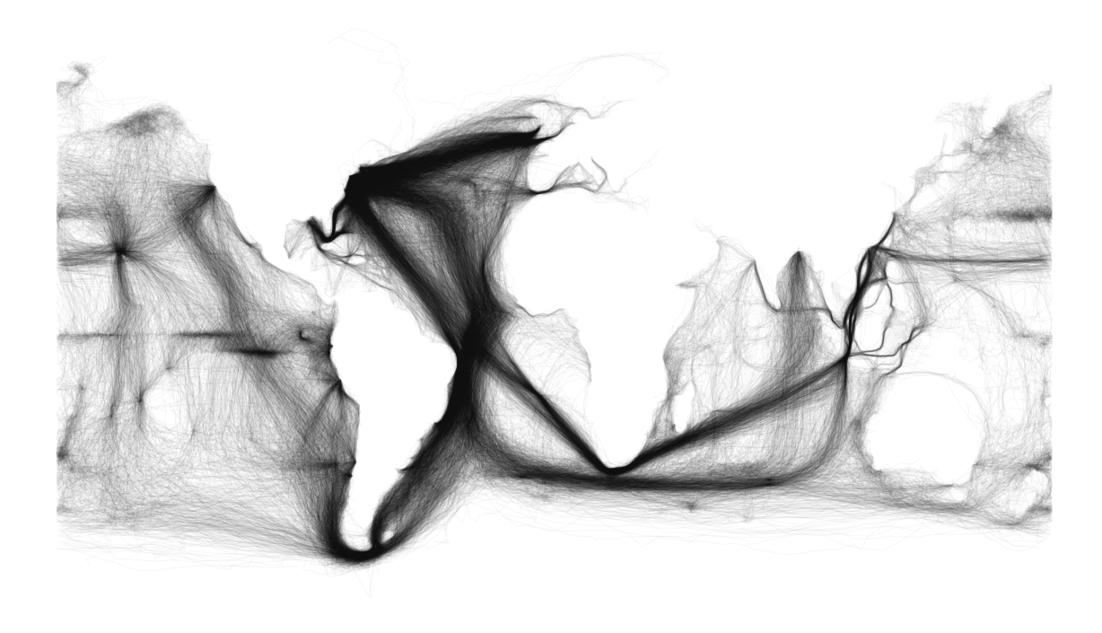
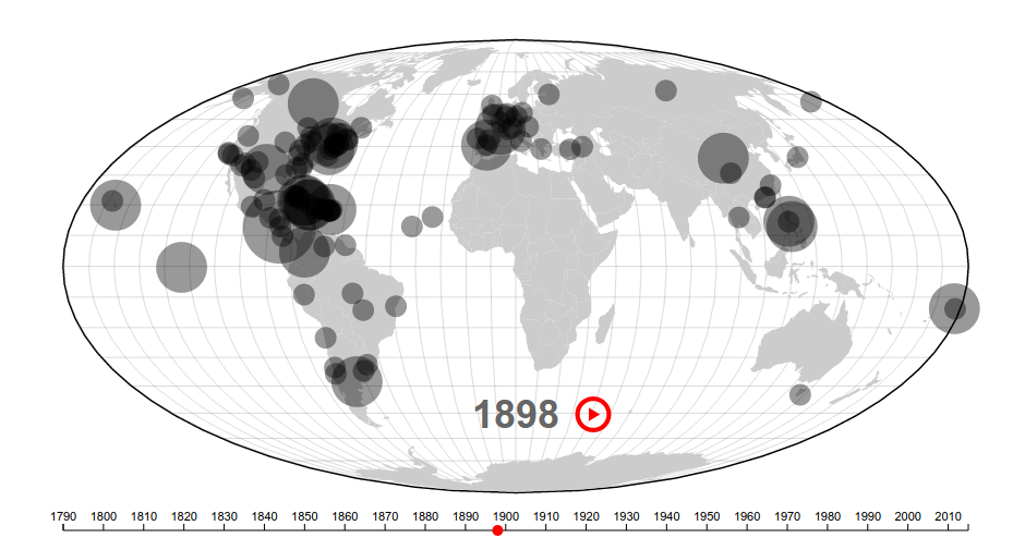
Ghost shipping paths
Probably the most widely-circulated image I’ve made is this chart that shows the paths of ships taken from the US Maury collection of the government’s database of ship’s paths. I made it to illustrate how rich metadata alone can be as a source for historical research: it’s also just an interesting way to see the continents through large-scale patterns of behavior. Several people asked for higher-resolution versions; I recreated a couple charts on the same concept here.
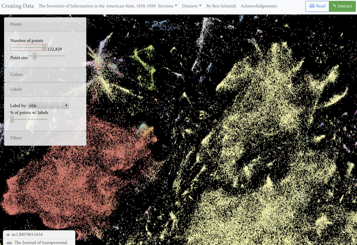
The Hathi Trust Library
This portion of Creating Data presents a new way to look at the digital library: a visual bibliography as a 15-million book zoomable scatterplot, displaying a variety of metadata and allowing you to click through to the Hathi Trust.
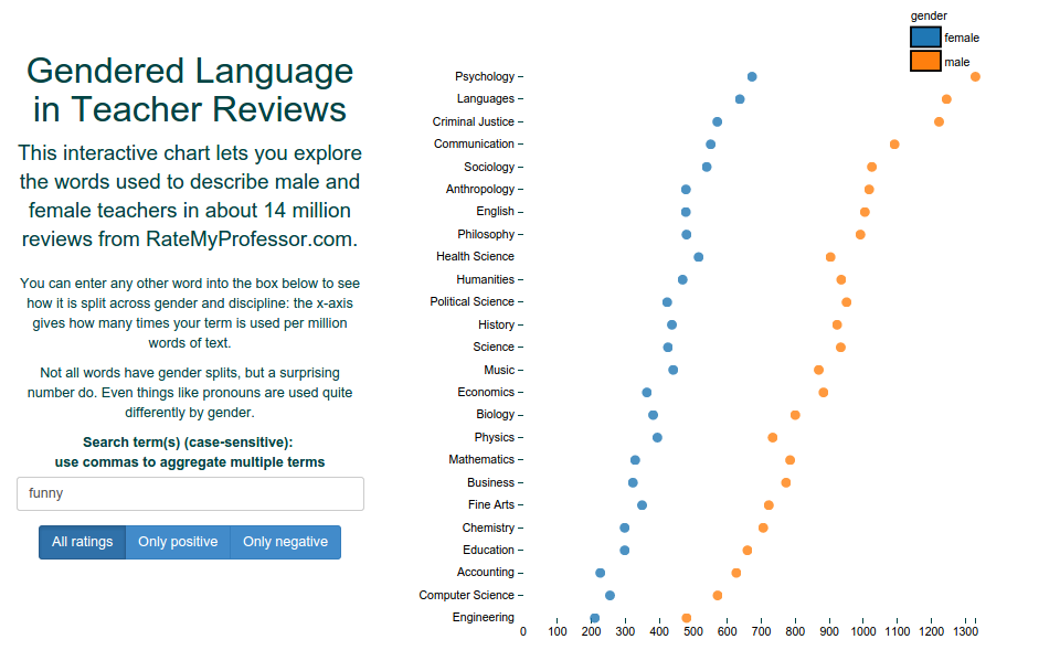
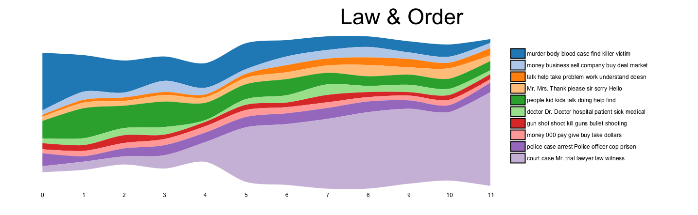
Gendered Language in Teaching Evaluations
An interactive exploration of the different language used to describe professors in multiple fields. As well as my explanation off the page, see the writeups in the New York Times and Chronicle of Higher Education. Built using the D3 interface to Bookworm.
Data Driven Projections: Darwin’s World
The hard part of this is really Philippe Riviere’s work, not mine: but I noticed that his new Voronoi Projection enables what I call ‘Data Driven Projections,’ map representations of the world customized for any set of points. The one below shows the voyage of the Beagle in the 1830s, with Darwin; you can change the observable notebook at this link for any dataset you like.
Archetypal Plot Structures
Using topic modeling and my database of 80,000 film and TV captions, I look at the typical plot structures for about 150 common TV shows. (This one is not an interactive, at least not yet: but it was all built entirely in the interactive bookworm browser.)
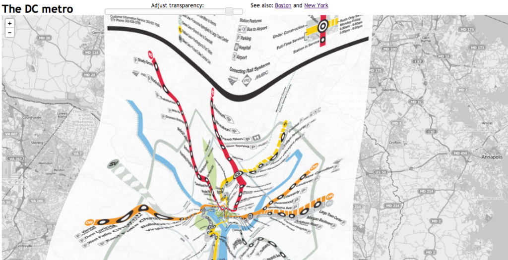
Corrected Subway Maps
This is a set of transit maps deformed to fit onto the Internet map-tile view of the cities (Boston, New York, Washington) they depict; it explores the tension between two different ways of representing the same urban spaces. Made using QGIS, Leaflet, and some command-line GDAL tools with maps and data from the transit authorities and tiles from Open Street Map.
Baseball leaderboard cherrypicker
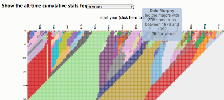
This lets you navigate through thousands of statements of the form “Jack Morris led the majors in wins in the 1980s” and decide which ones are important. It speaks to a larger collection of questions about how quantitative claims like those made in baseball (or in the earlier version of the same idea I made about college degrees) often take more context than the basic statements allow. Made using R and D3 from data in the Lahman database and from baseballprospectus.com.
College Majors and Degrees
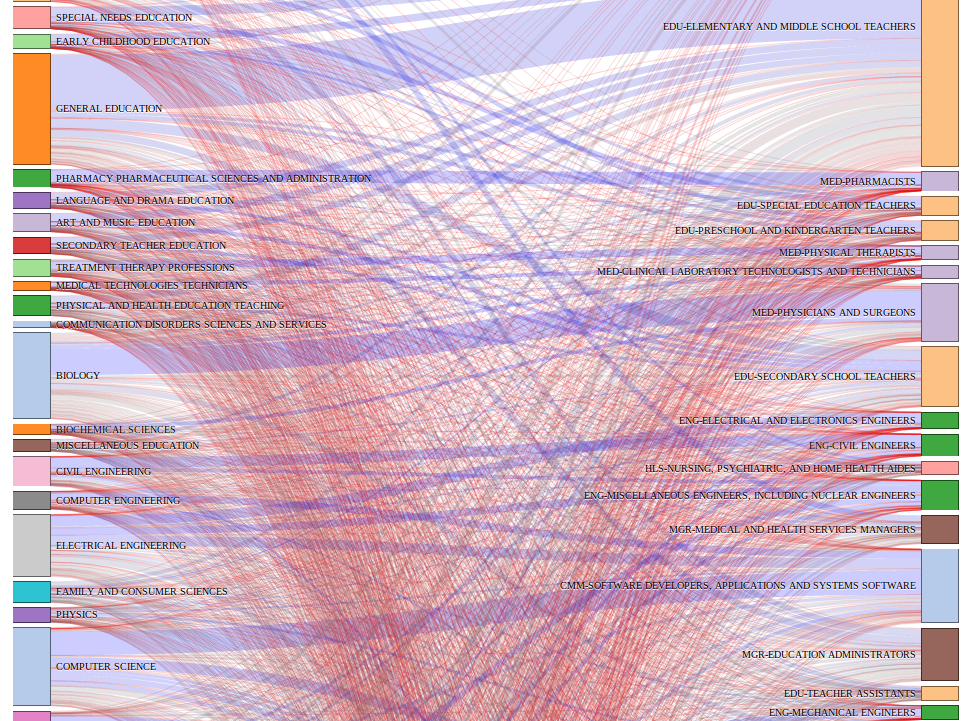
Students and professors alike often don’t know what careers a particular major leads into; using census data from the American Community Survey, this Sankey diagram lets you see many of the different paths that college graduates take. It’s a pretty basic 2-column sankey layout, but has two nice features: color coded lines to show relative significance of flows, and a click-to-zoom interface that lets you look at one particular field.
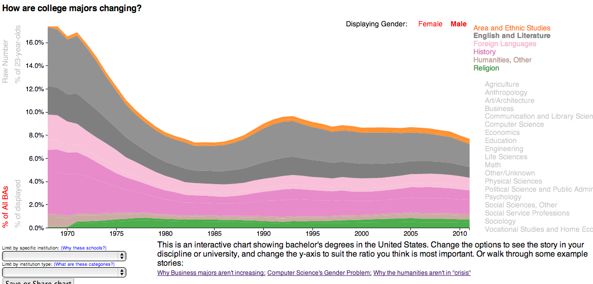
A practical visualization of department of education data about what college students major in: it’s highly interactive, and lets you choose which majors, you want to look at, which metrics of quantity, and which colleges you want to include. Also includes a few example story walkthroughs. Made using D3 with data from the NSF (and originally department of education).
Shipping animations
Using the shipping maps dataset, I also made a set of movies showing ocean sailing in motion using ggplot2 and ffmpeg. Here’s one of them; the rest are available on my YouTube channel, and I wrote quite a bit about them on my blog.
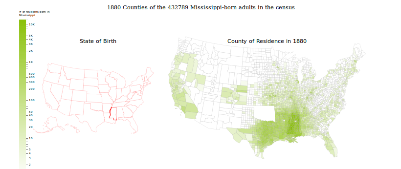
Migrations in 1880
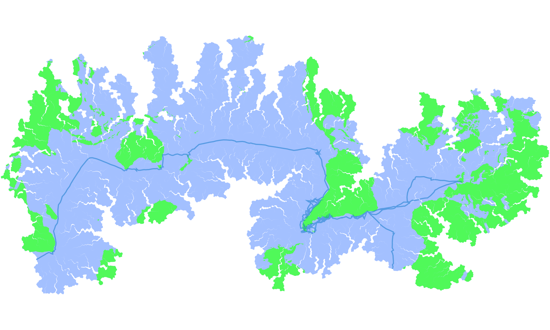
An experimental interactive map (experimental here meaning “too long a load time” to show interstate migrations in the 1880 census.) This can be used to explore some interesting stories about regional connections in the period after the end of slavery (for example, by looking at the relative sources of migration in different western counties to see which eastern states their residents came from.) Graphically, I found it interesting to have two maps (one of counties and one of states), which switch roles as legend or content depending on what direction of migration you want to look at.
Visualizing the State of the Unions
An animated interactive graphic for The Atlantic built using the Bookworm platform that shows thousands of places mentioned in presidential State of the Union addresses since George Washington. This was a collaborative effort: Mitch Fraas handled the geo-coding side of things, and Chris Barna at the Atlantic transformed the Bookworm code into something that would run statically on their site and added some nice effects to boot. Includes explanations by historians of foreign relations.
The important part here is the interactivity: click through to see just how that place was used in context.
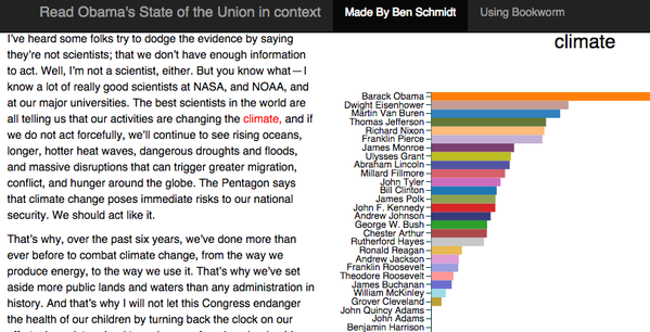
Reading the State of the Unions
An interactive form for reading any state of the union address in the context of every other one. Choose any address from a dropdown menu: click on a word, or highlight a phrase, to see how often every other president used it. Online here.