Graphing and smoothing
I mentioned earlier I’ve been rebuilding my database; I’ve also been talking to some of the people here at Harvard about various follow-up projects to ngrams. So this seems like a good moment to rethink a few pretty basic things about different ways of presenting historical language statistics. For extensive interactions, nothing is going to beat a database or direct access to text files in some form. But for quick interactions, which includes a lot of pattern searching and public outreach, we have some interesting choices about presentation.
This post is mostly playing with graph formats, as a way to think through a couple issues on my mind and put them to rest. I suspect this will be an uninteresting post for many people, but it’s probably going to live on the front page for a little while given my schedule the next few weeks. Sorry, visitors!
To state the obvious: we’re trying to chart change in language over time. Word frequency charts are a pretty obvious thing to chart, at least in English: I’ve been making them, historical language corpora make them, Google ngrams got enormous numbers of people making them for themselves. They can go way back: Gregory Crane presented some charts containing two thousand years of changes in Latin usage at the Digging into Data conference, which must be the record for a single time series.
These all look pretty much the same, but let me take three examples for now of how this can work before I move on to thinking about how line drawing and smoothing should work.
First, the default ngrams interface:
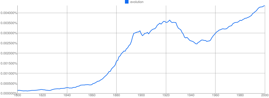
Next, the Corpus of Historical American English:

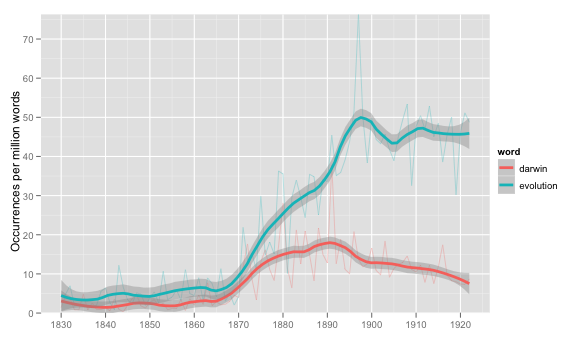
Finally, what I’ve been doing (which stops in 1922).
These all have a number of things in common.
All of them assume that the basic quantity we’re interested in is occurrences as a share of all words (although ngrams uses per cent, I use per mille, and COHA uses per million; the last is probably the best).
All apply some sort of smoothing, although the type varies. More on that below.
All fail have some poor graphic design choices–I’ve got ugly tick marks, COHA has way too many grid lines and a questionable use of a bar chart for univariate data, Ngrams has a nearly unreadable y-axis thanks to all those zeros. Ngrams is probably the winner here, though.
What are some particularly good features that everyone should have?
COHA allows you to drill directly into the source materials by clicking, and generally has a much more interactive interface. This is very useful—probably the most important supplement to the chart you can give—although for COHA it is somewhat limited by the (relatively) small corpus. It’s not necessary, I don’t think, for this to be built directly into the graphical representation, although that would be nice.
Ngrams allows you to change the smoothing on the fly; that’s nice.
Ngrams and I allow you to compare multiple words on the same scale: I also can compare subsets of genres and other arbitrary groupings of books to each other on a given word, which is really important.
This isn’t really fair: but I do like how I easily my version can include variants of words (evolution, evolutionary, evolutions), while in the public version of ngrams you can’t combine even lowercase and capital versions of a word. (There is a more customizable version for behind the scenes).
The big question that really arises here, though, is smoothing. Ngrams using changeable windows of moving averages; COHA groups by decade to eliminate year-to-year noise; I use a moving loess average. What’s optimal?
This is a tricky question. To get the easy answer out of the way first: it’s not plotting by decade. Plotting by decade should always be avoided. From a statistical point of view, plotting by decade is exactly the same as taking a 10-year moving average in n-grams (actually halfway between what ngrams calls a four-year and a five-year average, but you get the point), throwing out 9/10 of the data, and making the remaining year tall and blocky. The benefit of throwing out all that data is virtually nil, and it makes underlying patterns harder to see. There’s a plunge in the COHA data after the 20s–at first, I thought this might have been related to corpus composition changes related to the 1922 copyright cutoff date. If COHA presented information like ngrams, it would have been clearer the drop was later—more like 1926, suggesting the interesting event to look into is the Scopes trial.
You might argue from a user interface perspective that decades at least block data into compartments we understand. But from a historical perspective, that’s just what we should be trying to avoid; decade stereotypes are generally poorly thought through, but popularly held ideas people have about history. (I’ve always thought the stereotype of the “Roaring Twenties” is a big reason the labor unrest and depression in 1919-1921 is mostly forgotten). Designing an interface that reinforces a belief that national culture realigns once every ten years by the clock, and remains relatively constant inside the bins, is going to be contrary to exploration that helps us to see new things about the past. It has, to the contrary, a serious bias built in towards confirming existing patterns that are relatively spurious.
What about moving average smoothing? It’s better, but still has some issues. It flattens one-year aberrations into plateaus over a number of years, which is acceptable but often undesired behavior. One-year blips usually tell us very little about the general trends that ngrams seem most useful for looking into. Sometimes peaks are random noise, in which case we probably want to include them. But there can also be historical reasons for a peak (like presidential centennials), and in that case it would be better not to apply it to surrounding years.
That, roughly, is why I like to use loess smoothing, which gives a very smooth underlying curve; it tends to eliminate noise much more than moving-average smoothing, while catching the underlying trends about the same. It’s a little messy to include both the yearly variation and the smoothed version, but the aggressive smoothing of loess makes that easier.
What will this look like? I’ve been occasionally fooling around with the R package ggplot2, which has a very well thought-out philosophy of both graphical design and interaction with variables. Medium-term, I’d like to keep that going. Here’s a first pass at presenting a year plot for two terms with loess smoothing:
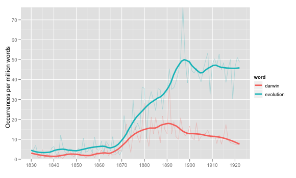
This is generally pretty good, I think, although it’s still missing the interactive element I like about COHA. ggplot really is quite pretty, and the philosophy of ggplot combined with some good data storage in MySQL makes it easy to put together a split by something other than word, such as LC classification (this is for usage of the word ‘ evolution ’ in two fields which are 5-10x above the norm):

There’s still some question in my mind about whether loess works better than moving averages: the following example, though, shows why it might. I’ve superimposed on the raw data for ‘ evolution ’ a loess average with span=.25 and what ngrams calls a 3-year moving average. The general curve for each is almost exactly the same; the difference is that loess is considerably smoother, ignoring the local variations a bit more in favor of the surroundings.
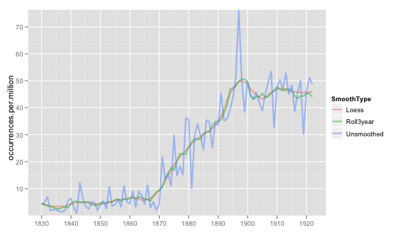
If a loess span looks like a moving average but smoother, that seems about perfect. There are some problems with loess—every once in a while, it takes momentum too seriously and predicts a negative rate of occurrences, for instance—but in general I like the aesthetics of it better than moving averages.
That’s all just to take me to where I am now. There are two much more interesting questions:
Is occurrences per million the best metric to use? Some of the jumpiness in the data is the result of just a few books, I suspect. A metric like ‘ percentage of books containing “evolution” ’ is smoother, and in many ways better. There are other possible metrics, too—we could use a median, for instance (how often does the _average_ book use evolution), or something more complicated (I have a hunch that one of the parameters on some type of distribution—beta?—modeled for each year makes more sense than occurrences per million).
We can use loess or a moving to predict the value for any given year. But how can we characterize the error around that value? It’s possible to get a 95% confidence interval for where the loess should be, as shown below, but that’s not necessarily the value we’re interested in.
These two questions are actually related—the type of error bar we would want to see, and our chosen metric for change in usage over time, both fundamentally depend on why we think a particular metric is good at explaining change in language over time. (Which is connected to what ‘ change ’ we think is significant, and what we want to filter out). I have a couple ideas to work out on these, but I’m going to post this before I box myself in.
(Last picture: example error bars)